



Industrial Landscape Design
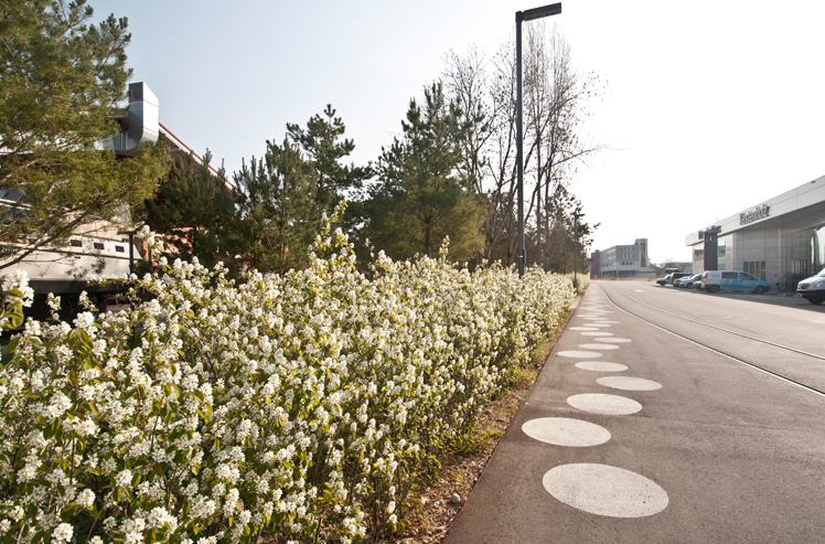
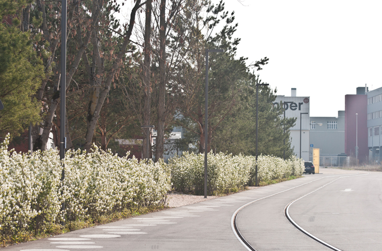
Between large-scale buildings, railway tracks and traffic, the master plan created a clear spatial system based on the old structures: The magnetic axis is the new spatial backbone of the area. The main access, the parking spaces and the scarce open space, which has been redesigned for optimal usability for the people who work here, are arranged along this axis.
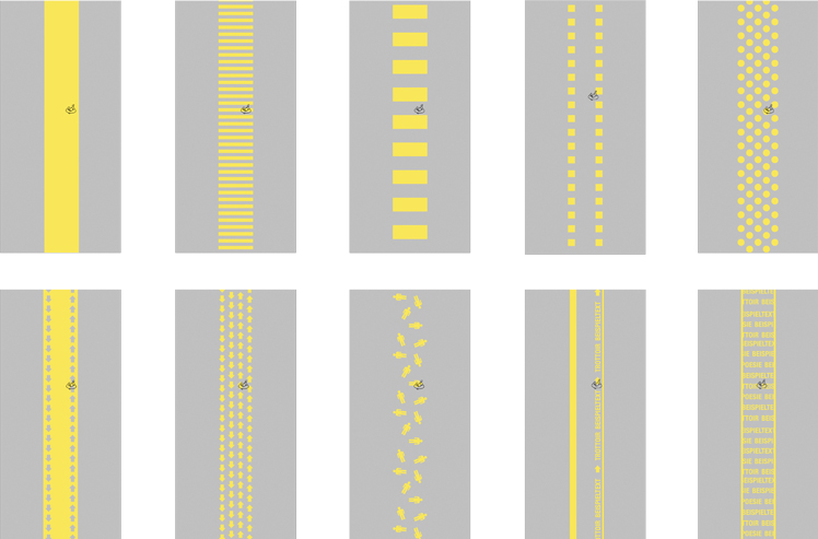
The traffic routing is as simple and obvious as it is unusual: White dots mark the footpaths, white lines the traffic routes and rectangular, also white markings the parking spaces. The zoning via the floor lettering maintains the space as a continuous, trafficable area without steps and yet structures it clearly. Narrow green spaces with shadbushes accompany the linear axis and separate the rail tracks from individual traffic. Pine trees are interspersed between the shadbushes shading and emphasizing the axis.
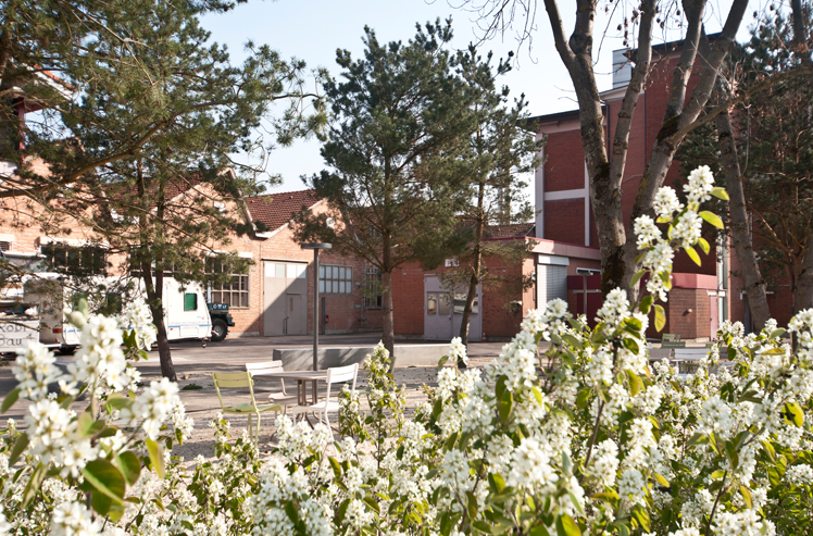
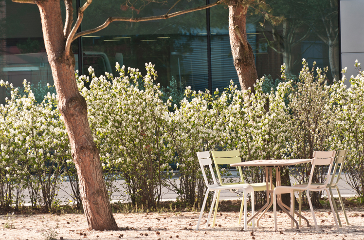
In the centre of the site, the green line widens into a pocket park. It has been literally cut out of its surroundings – and the hard surface. Where concrete and asphalt once reigned, pine trees and shadbushes now form a small grove. Benches, tables and barbecue areas provide space for a break or lunch. Smaller, human-oriented spatial units lie between asphalt surfaces, trucks and large buildings. Few design elements – the axis, the white ground lettering, the elegant growth of the shadbushes and the rich green umbrellas of the pines – give the place its unusual identity of down-to-earth design.
Awards
Award “Auszeichnung guter Bauten” 2018: Magnetareal Pratteln , 30.10.2018
Chronicle News
Swiss-architects is pleased about Basel’s award-winning urban spaces , 02.11.2018
Double Award! , 31.10.2018
Baustellenessen auf dem Magnetareal in Pratteln , 20.09.2013
Ein Föhrenhain entsteht… , 20.03.2013